Bookstore Stierle
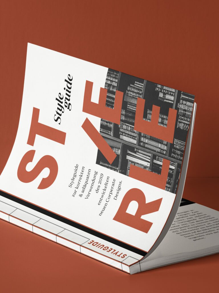
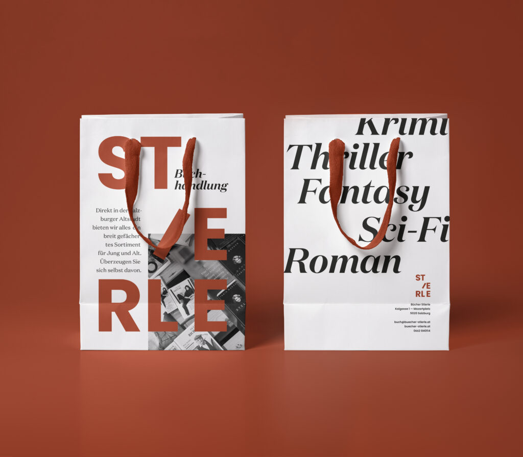
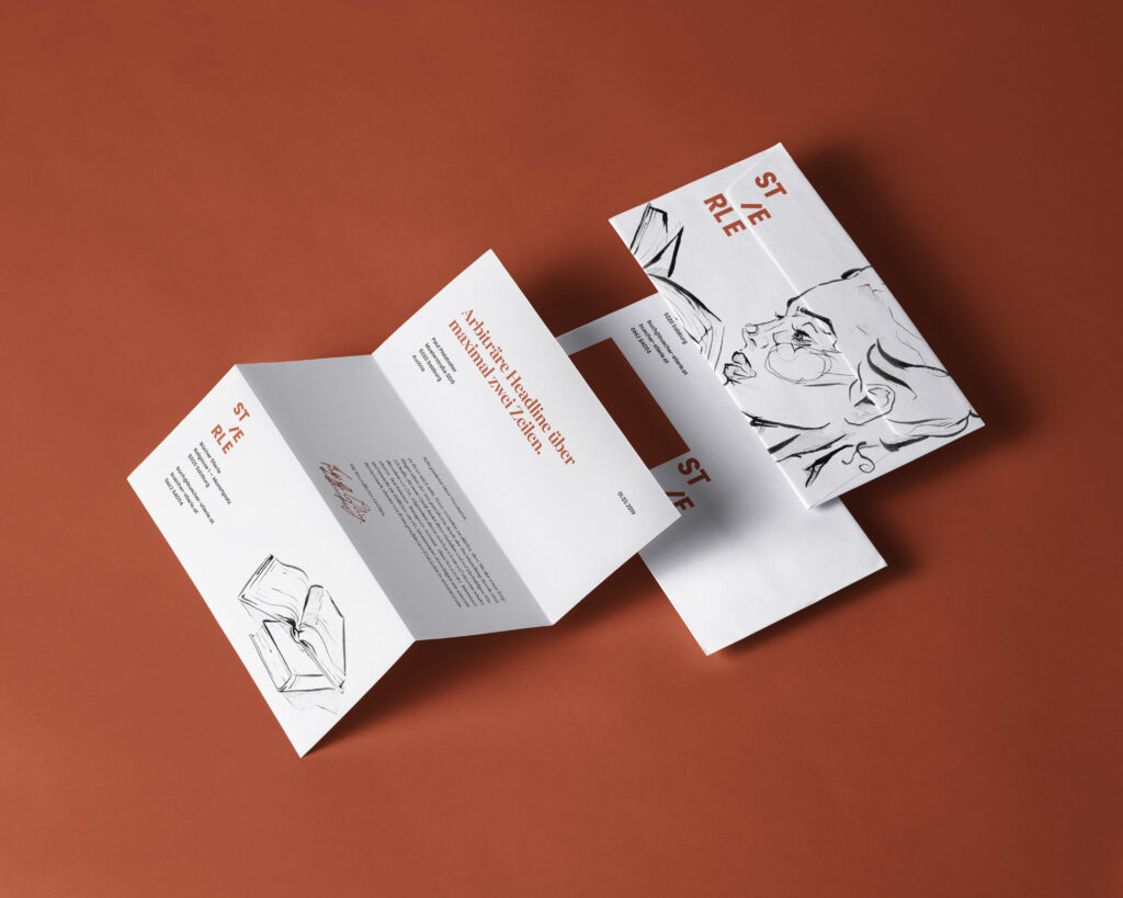
Together with two classmates, I worked on a redesign for a small bookstore in Salzburg’s old town. My area of responsibility included the development of a new logo, the creation of the entire corporate design as well as a style guide. In addition, I designed numerous applications such as the business stationery and other print products. In the entire design only two colours, black and rust red, and their gradations are used. This leads to a consistent overall image. A shade of red very similar to the one chosen is described by John Berger in one of his letters to John Christie with the following words:
“Red is not usually an innocent colour. But the red you sent me is. It’s the red of childhood. A pretend red. Or the red of young eyelids shut tight. The red you saw when you do that.”
The letters of the are arranged in a way that they appear to be books on a shelf. The oblique I leaning against the E reinforces this effect. In terms of content, the logo thus leads to several connotations: The bookshelf represents a peculiarity of the physical book. The filled shelf can be understood as a reference to the range of products offered and the overview that buying on the spot provides.
2nd Place Salzburger Landespreis für Werbung
Collaboration with Laura Ebner and Hannah Roider
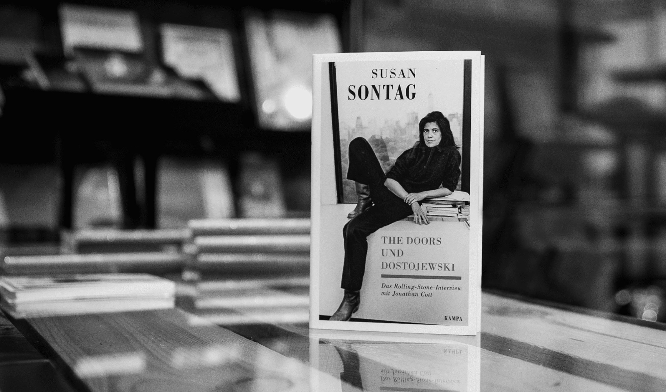
© Hannah Roider
